
Color Theory Basics Every Home Decorator Should Understand
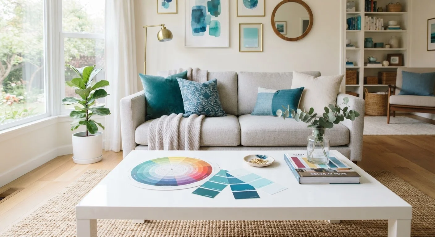
Photo credit: seeksmartgrowth.com
In this article
A plain-language introduction to how colors interact, what terms like complementary and analogous mean, and how to apply them.
Key Takeaways
- The color wheel organizes colors into predictable relationships you can use when choosing paint and decor.
- Complementary colors sit opposite each other and create strong contrast; analogous colors sit side by side and feel harmonious.
- Hue, value, and saturation are three separate qualities you can adjust independently to change a room's mood.
- Warm colors tend to make spaces feel smaller and cozier; cool colors tend to make them feel larger and calmer.
- Testing paint samples on your actual walls before committing prevents costly repainting mistakes.
What the color wheel actually tells you
The color wheel is a circular diagram that arranges colors according to how they relate to each other. It is not just an art-class tool. For home decorators, it answers a practical question: which colors work together and which create unintended visual friction.
The wheel is built from three layers. Primary colors (red, yellow, blue) cannot be mixed from other colors. Secondary colors (orange, green, violet) come from mixing two primaries. Tertiary colors sit between each primary and secondary pair, giving you colors like red-orange or blue-green.
When you understand where colors sit on the wheel, you can predict how combinations will feel before spending a dollar on paint or fabric.
Primary colors
Red, yellow, and blue are primary colors. They cannot be created by mixing other colors together.
Complementary colors
Two colors that sit directly opposite each other on the color wheel. When placed next to each other, they create strong visual contrast.
Analogous colors
A group of three or four colors that sit beside each other on the color wheel. They share undertones and tend to look harmonious together.
Saturation
How vivid or muted a color appears. A fully saturated color is bright and pure; a low-saturation version of the same color looks dusty or faded.
Value
How light or dark a color is. Adding white raises its value (making a tint); adding black lowers it (making a shade).
Color temperature
Colors are grouped as warm (reds, oranges, yellows) or cool (blues, greens, violets). Temperature affects how a space feels and how large or small it appears.
Key color relationships and what they look like in a room
Color theory identifies several named relationships, each producing a different visual effect.
Complementary
Complementary colors sit directly across from each other on the wheel. Blue and orange are one example; red and green are another. These pairings create strong contrast. In a room, using both at full intensity can feel overwhelming, so decorators typically use one as the dominant color and the other as a smaller accent.
Analogous
Analogous colors are three or four colors that sit next to each other on the wheel, such as yellow, yellow-green, and green. They share an undertone, which is why rooms built around analogous palettes feel cohesive and calm. This is a reliable approach for beginners. For practical room-by-room examples, see the room-by-room decorating guide.
Triadic
A triadic scheme uses three colors spaced evenly around the wheel, such as red, blue, and yellow. The result is visually lively. To prevent chaos, keep one color dominant and use the other two in smaller amounts.
Split-complementary
This variation takes one color and pairs it with the two colors on either side of its complement. It creates contrast without the full tension of a direct complementary pairing, making it a useful middle-ground option.
Hue, value, and saturation: the three controls
Choosing a color is not a single decision. Every color has three qualities you can adjust independently.
Hue is the color itself: blue, red, green. It is the name on the wheel.
Value is how light or dark that color is. A tint adds white to a hue (turning red into pink). A shade adds black (turning red into burgundy). A tone adds gray, reducing intensity without dramatically shifting lightness.
Saturation describes how pure or muted the color is. A highly saturated color is vivid; a low-saturation version of the same hue appears dusty or earthy.
Most decorating mistakes happen when one of these three qualities is ignored. Two colors can share the same hue but clash because one is highly saturated and the other is muted. Adjusting value and saturation to match across your palette is often more important than picking colors that are technically related on the wheel. This is especially relevant when working with neutral walls; the challenges neutral walls create often come down to mismatched undertones in value and saturation.
Warm and cool colors and how they affect a space
Colors are grouped into warm (reds, oranges, yellows) and cool (blues, greens, violets). This distinction has real consequences for how a room feels.
Warm colors appear to advance visually, meaning they seem closer than they are. A warm-painted wall feels nearer, which can make a large room feel cozier but a small room feel tighter. Cool colors recede, which can make walls feel farther away and a room feel more open.
These are tendencies, not guarantees. The amount of natural light in a room, ceiling height, and the size of furniture all interact with wall color. A pale, low-saturation warm color may not advance noticeably, while a deep, highly saturated cool color can still feel enveloping.
Test your paint before committing
Paint a sample patch at least 12 inches square directly on the wall rather than on paper. Look at it in morning light, afternoon light, and under your artificial lighting at night. Colors with warm undertones can look dramatically different under cool fluorescent bulbs than they do in natural daylight.
Avoiding color-related decorating errors is easier once you understand these principles. The common mistakes that make rooms feel smaller often involve unintentional use of warm, dark, or high-saturation colors on walls where a cooler or lighter option would serve better.
How to start applying color theory at home
Theory is only useful when it connects to decisions you can actually make.
- Pick a starting point: one piece of furniture, a rug, or an artwork you already own and want to keep. Identify its two or three main colors.
- Find those colors on the wheel and determine their relationship. If they are analogous, build your room palette around nearby hues. If they are complementary, use the less dominant color sparingly throughout the space.
- Adjust value and saturation to suit the room's light and size before finalizing any color. Lighter, lower-saturation versions of your chosen hues are often easier to live with at scale.
- Test paint samples on the actual wall, at least 12 inches square, and observe them at different times of day. Artificial light shifts how hues read, particularly colors with strong undertones.
Once you have a palette you understand, decisions about accent walls, textiles, and accessories become much more straightforward. For guidance on one of the most common next steps, the guide to accent walls explains when that approach adds visual interest and when it works against the room.
Frequently Asked Questions

Author
Home Decor Editorial Team
Home Decor Editorial Team is the collective byline for our editorial team and contributor network. Articles published under this byline or an editorial pen name are researched, written, and reviewed according to our editorial standards for clarity, consistency, and independence before publication.
View all articles →